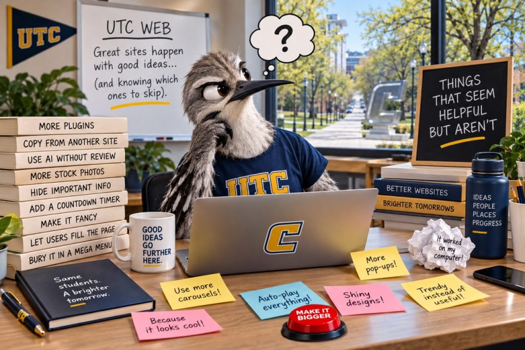
Sometimes good intentions make for not-so-good web content. Here are some familiar offenders:
- “Click Here”
Seems helpful. Isn’t. Tell people where the link goes instead: “View the academic calendar.” Bonus: screen reader users will thank you. - A PDF of a flyer
Looks great on your office bulletin board. Maybe not so much on a phone or screen reader. If the information belongs on the web, consider making it a webpage instead. - ALL CAPS HEADINGS
VERY IMPORTANT LOOKING. NOT NECESSARILY VERY READABLE. Use clear, descriptive headings and let the website handle how they look. - “Welcome to the Department of…”
Your visitor already knows where they are. Instead, use that valuable space to tell them what they can do, find or learn there. - Opening every link in a new window
You might think you’re helping visitors keep their place. Instead, you’re taking control of their browser and potentially confusing them. Let visitors decide when they want a new tab. - “For more information…”
More information about what? Links should make sense on their own. Try “Learn about financial aid options” instead. - Putting everything on the homepage
If everything is important, nothing is important. Your homepage should help visitors find their next step—not contain every step. - Making something bold, bigger or a different color instead of using a heading
It may look like a heading, but that doesn’t make it one. Use actual heading styles so the structure of your page works for everyone. - Uploading another copy “just in case”
Now there are two versions of the same information—and eventually they’ll disagree. Whenever possible, maintain one authoritative source and link to it. - Keeping an old page because “someone might still need it”
Maybe. But outdated content can be worse than no content at all. If a page no longer serves a clear purpose, update it, archive it or let it retire with dignity. - “Read More”
Read more about what? When a page has several “Read More” links, they’re especially unhelpful to people navigating by links. Try something descriptive like “Explore undergraduate research opportunities.” - Underlining text for emphasis
On the web, underlined text looks like a link. If it isn’t clickable, visitors may spend a few seconds wondering why it’s broken. Use emphasis styles for emphasis and save underlines for links. - Using a table to make things line up
Everything is beautifully arranged in rows and columns—until someone views it on a phone or uses a screen reader. Use tables for actual tabular data, not page layout. - “See below”
Below where? On a phone, “below” might be several screens away, and a screen reader user may navigate the page differently. Refer to the section or heading by name instead. - Putting important information in an image
That graphic may look fantastic, but search engines, screen readers and people zooming on a phone may have a harder time getting the information from it. Put essential information in actual webpage text. - Using headings because of how they look
H2 is too big, so you choose H4. Problem solved—visually. Structurally, not so much. Choose headings based on the organization of the content, not their appearance. - “Coming Soon”
Coming when? A “Coming Soon” page created three years ago isn’t building much anticipation. Publish when you have useful information to share—or include an actual timeframe. - Putting an email address everywhere
Sometimes contacting someone really is the next step. But if 50 people are likely to ask the same question, the answer probably belongs on the website first. - Adding “Important!” to make something important
IMPORTANT! PLEASE NOTE! ATTENTION! If everything is urgent, visitors quickly learn to ignore all of it. Good placement, clear headings and concise writing do a better job of establishing priority. - Writing for the organizational chart
Visitors don’t necessarily know which office, division or committee owns the thing they need. Organize and describe content around their task, not your internal structure. - Listing every possible audience
“Information for students, faculty, staff, parents, alumni, visitors and community members…” Congratulations—you’ve described almost everyone. Focus instead on what people came to the page to accomplish. - Using “FAQs” to avoid organizing the content
Sometimes FAQs are useful. Sometimes they’re just a very long page where every heading is a question. If the information has a natural structure, give it one. - Repeating the same information on several pages
It feels convenient—until the tuition amount, deadline, phone number or policy changes and someone has to remember everywhere it was copied. Write it once and link to it. - Putting the date in an image
Nothing says “quick update” like finding the original Photoshop file because the event moved from Tuesday to Wednesday. Keep details that may change as editable webpage text. - Using the homepage as a filing cabinet
That link might be useful to someone, but that doesn’t mean it belongs in the main navigation or on the homepage. Design navigation around common visitor needs, not requests to “add our link somewhere.” - Keeping content because “we’ve always had it”
Longevity isn’t the same thing as usefulness. Every page should have an audience, a purpose and someone responsible for keeping it accurate. - Writing like a university
“The Office of Whatever endeavors to facilitate the provision of resources…” You’re allowed to say “We can help you find…” Clear, conversational language isn’t less professional. It’s more useful.
Editor Action: Find it. Fix it.
Open one page you manage and look for at least one of these offenders. Replace that “click here,” rethink that PDF, fix that heading, remove outdated information or give your introduction a purpose. Then, if you’re feeling ambitious, find another one.
Need help figuring out the better approach? Read “Creating Better Content for the UTC Website” for tips, how-tos and guidance.